
projects | Viabizzuno progettiamo la luce
discover all the Viabizzuno designs and projects in collaboration with the world’s leading architects and designers.


 en
en
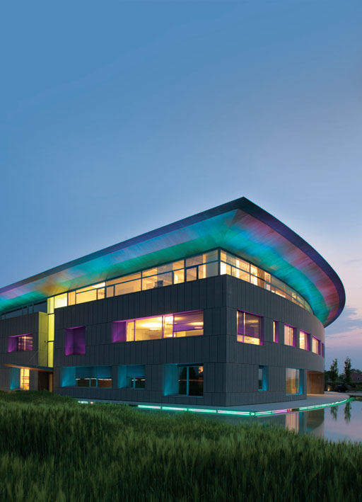
new headquarters for nice
place:oderzo, treviso
project:carlo dal bo
lighting project:sergio pellizzatto, stingers
there cannot be good architecture without a good client and, in the case of the new nice headquarters in treviso, the questions of design and context defined by the client were of particular importance.
the client lauro buoro showed notable sensitivity, expertise and style in this venture, undertaken in close contact with the designer, carlo dal bo.
this enterprise began in 2000 with an ideas competition by invitation for the construction of the new nice warehouse and offices.
the project involved a large warehouse, largely following the site plan and an office block lying on top like the great bridge of a ship underway.
the development of the design leading to completion differed in reality from the initial ideas but kept the composition principles intact.
perhaps the greatest feature of the warehouse construction project was the location of the continuous skylights immediately above the great steel arches, flooding them with light and making them lighter as a consequence.
the site dimensions then determined the size of the bays, about 40 metres for the first eleven, 65 metres for the intermediate one and 84 for the two double bays going down to the ground and separated from the others by a ‘corridor' with a transparent roof.
the offices were built subsequently and their design character can be summarised by the words morphology and movement.
nice makes movement or rather moving parts; its very beautiful products, which have contributed to its success and were designed by roberto gherlenda, are used to ‘make things move', ranging from gates to curtains.
so movement had to be at the heart of this project.
the office block comes (springs) out of the ground, spirals around the void of the central courtyard and carries on rising on the same side as it started.
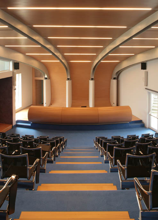
the configuration of the building is dynamic; the rings (floors) of the internal courtyard are like ‘ring nuts' running one on top of another and giving the suggestion of rotation, while the stairs are elliptical and spiral upwards; the auditorium is a shell shaped in section taking its origins from the panel that rolls along the floor to become a wall and then a ceiling, while the glazing to the fenestration on the southern side is at an angle to the façade, giving an imaginary impression of the building running.
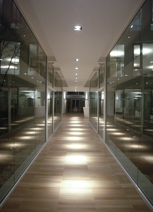
as well as the configuration, the use of lighting in this project, both natural and artificial, deserves a mention.
natural lighting: lighting was already a very important aspect of the initial design but it was during the works on site, that it took on a particular significance.
once the structure was erected, it was evident that one could see ‘through' the building from every angle; all areas were flooded with light and the continuity of the space had to be maintained.
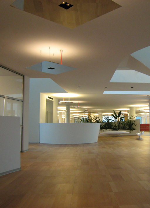
from observation on site, the designer decided to accentuate two existing features of the project, to increase the ‘open spaces' and, wherever possible, to use glass partitions where division walls were required.
so by day, light continuously permeates the building and one can see right across it.
artificial lighting: naturally we cannot ask artificial lighting to be the same as natural light, we can ask both less and more of it; we can still ask it to cross spaces, though not with the same ethereal lightness but this very ‘less' can immediately become a ‘more'.
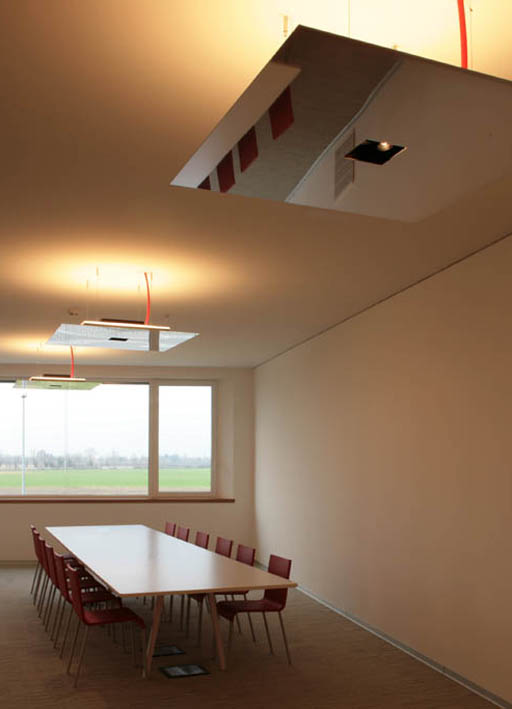
the lighting design was the result of matching the architectural designer's requirements with the skills of the lighting designer.
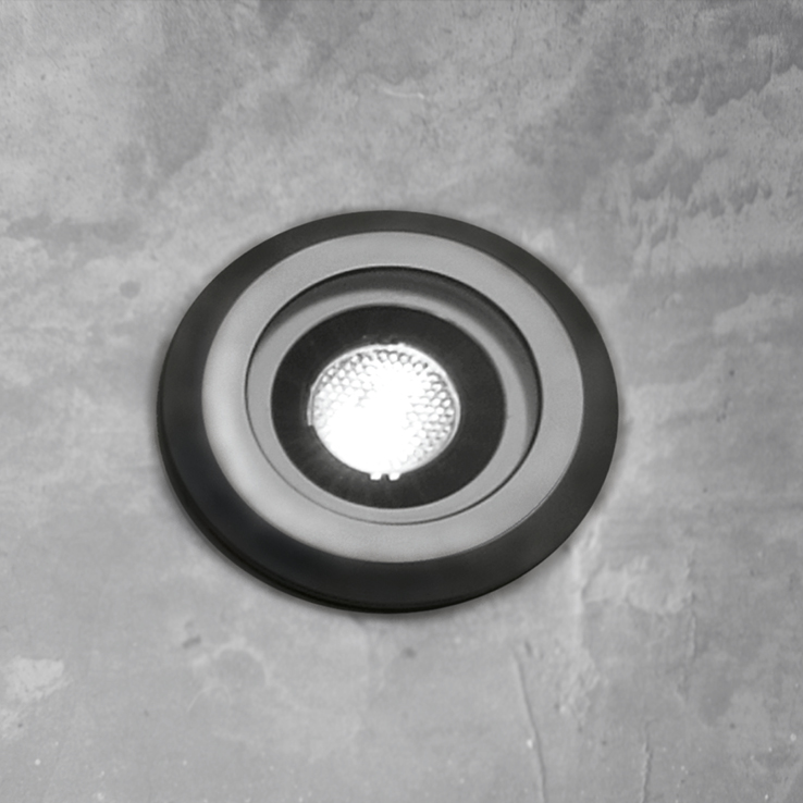
the architect asked for ‘luminous leaves on the ceiling' and hence the special m7 fitting created by Viabizzuno, which then became the heart of the internal lighting, while the ‘bacchette magiche' (magic stick) fittings were used externally for the route along the deck amongst the corn and the ‘120 incasso' recessed fittings to create a ‘pick-up sticks' effect in the gymnasium.
the attention that the designer paid to the lighting design falls within a wider design concept, inspired by the aim and the demand for a healthy workplace environment in the architectural interiors.
what makes a healthy environment? in addition to the use of lighting, the design sought to achieve the feeling of well-being using other tools closely associated with lighting, i.e. colour and materials.
colour: colour was used in the carpeting (also necessary for acoustic absorption), in the furniture by denz where ‘the colours of le corbusier' range was used (together with tables and chairs by vitra) and on the walls where a different colour has been used on every floor.
materials: the extensive use of glass, although on the one hand making for a healthy environment by admitting natural light, on the other risks producing a feeling of coldness, so the coldness of the glass was offset by the material that is warm par excellence, i.e. timber.
so timber was used for the doors and windows of the oval courtyard, the flooring of the entrance, bar, and refreshment area, for the windowsills and the doors in the walls of glass.
in the bar is a whole wavy wall clad in zebrano. in the basement, around a central garden, a gymnasium has been set up together with a genuine relaxation area with sauna and turkish bath.
in reality, the internal courtyard is an internal garden, large enough for one to be aware of the changing colours and seasons, the rain, the wind and the changeable light of the sky. this area becomes the heart of the project in which lighting, materials and a healthy environment come together in a single entity. in reality, the internal courtyard is an internal garden, large enough for one to be aware of the changing colours and seasons, the rain, the wind and the changeable light of the sky. this area becomes the heart of the project in which lighting, materials and a healthy environment come together in a single entity.
scroll


 Page loaded in: 0.078 - Powered by Simplit CMS